Navigating Through Interactions
When a new instance of an Interaction is started, the first page of the Interaction is displayed. The Next and Back buttons, at the lower right corner of the page, enable navigation through all the pages of the Interaction.
Most features of an Interaction displayed in the Agent Application are defined by the designer who created the Interaction (using the Interaction Designer). For example, the page title and the content that is displayed on a page is determined according to the Interaction element corresponding to that page (Question, Statement, etc.). For more information on designing Interactions and using specific Interaction elements, refer to the Interaction Designer User Guide.
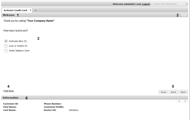
The main features of a typical page of an Interaction are listed and described in the table following the diagram.
Number |
Feature Name |
Description |
|---|---|---|
1 |
Page Title |
The text that appears in the title bar. Generally, the title summarizes the content or purpose of the page. |
2 |
Help button |
Clicking this icon opens a popup that provides more information about the page and how to use it. The Help button appears only on pages for which help was configured in the Interaction Designer. |
3 |
Content area |
The main work area of the page, where users select choices, enter input, upload data, and receive feedback messages. |
4 |
Add Note link |
Clicking this link opens a field in which users can enter free text. For details, refer to Adding Notes. |
5 |
Action buttons |
These buttons enable you to progress to the next page, return to the previous page, or save the Interaction instance. On the last page of an Interaction, there is a Done button (instead of a Next button). |
6 |
Information area |
This area lists data relevant to the caller and/or the system. For details, refer to Viewing the Information Area. |

