Viewing Reports

Contents
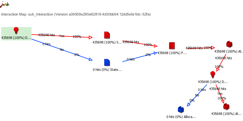
A report can be viewed in the following modes:
•Hit Map: Displays the data in terms of quantity (i.e., how many times each flow within the Interaction was performed during the selected timeframe).
•Performance: Displays the data in terms of time (i.e., how many seconds were spent on each flow within the Interaction during the selected timeframe).
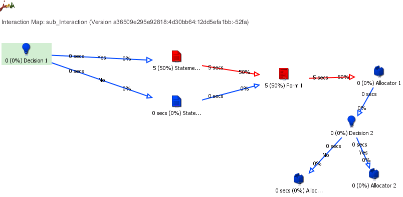
Both modes use color coding to symbolize the pattern of each flow in the Interaction. The colors range from blue (light use or less time) to red (heavy use or more time).
1From the listbox in the upper left corner of the report, select from the following options: •Hit Map Report: Shows the report in heat map mode. •Performance Report: Shows the report in Performance mode. •Display Raw Data: Shows the data in numbers (number of times the flow was used or number of seconds that the flow took). •Display Percentage: Shows the data in percentages. 2Click Refresh Report. Report data is displayed according to the options selected. |