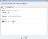
Configuring Input Settings
These parameters determine how users’ answers are formatted. This tab is enabled only when the Question Type is The user can provide input.
Setting |
Description/Notes |
||||||||||||
Input type |
Enables you to select the type of response that can be entered by users:
The options that appear below the dropdown list vary according to the option selected. Note: When you select an input type of Short Text, Number, Currency, or Date, the Format button is enabled. The Format feature allows you to specify how the input will be displayed in runtime. For more information, refer to Working with Data Type Formatting. |
||||||||||||
Preview Lines |
The number of lines displayed in the input text component. |
||||||||||||
Max Characters |
Maximum number of characters that can be entered in the input text field. |
||||||||||||
Default Value |
When this radio button is selected, an assigned value is displayed as the default answer. Users may change this answer if it is not relevant to them. When configuring the assigned value, clicking the Browse icon opens the Default Value window, where you can create a dynamic text message by dragging and dropping predefined elements into the message. |
||||||||||||
Place Holder |
When this radio button is selected, a preconfigured text (in gray font) is displayed to users, who then replace this text with their own answer. The placeholder text generally provides an example, or prompts users about how to respond. |
||||||||||||
Validation settings |
Allows you to configure valid ranges for user responses. For example, you can set a range for valid numeric entries, so that only numbers between 1 and 10 are accepted. When you select Custom Validation, clicking the Browse icon opens the Custom Regex dialog. In this dialog, you can define a custom regular expression with which data is compared and validated. When you select Integration Point Validation, clicking the Browse icon opens the Integration Point Validation dialog. In this dialog, you can select an Integration Point to be used for validating the user's input. For more details about Integration Points and their definitions, refer to the Jacada Interaction Server Administration Guide. |

