Defining a Choice Lookup Item
Creating and modifying a Choice Lookup element involves specifying parameters in the following tabs of the Choice Lookup Definition dialog:
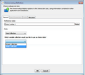
•General: Defines the element name and the source to be used for the choice display (Integration Point or Collection).
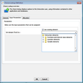
•Input Parameters: Specifies the parameters (if any) that are assigned to the IP request. If a collection is selected as the source, this tab is disabled.
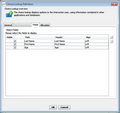
•Fields: Allows you to select the fields that are shown to the end user, and to customize their display. This tab is relevant only if an object collection is selected as the source.
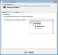
•Allocation: Defines a Variable element in which to put the selected choice.
This tab defines the name of the Choice Lookup element, and specifies the source to be used for the choices. The following source type are supported: •An Integration Point that returns a collection •A collection (either simple or object)
|
This tab allows you to select the parameters that are assigned to the IP request. The Parameters frame lists all the input parameters that are defined in the selected IP. Input parameters can be set in one of the following ways: •Check the Use existing element checkbox, and then select the relevant parameter from the dropdown list. •Clear the Use existing element checkbox, and then enter the parameter in the textbox. |
This tab is enabled only when an object collection is selected as the source of the choices. The tab allows you to select the fields that are shown to the end user, and to arrange their display. When configuring field presentation, keep the following system behavior in mind: •When the Question preceding the Choice Lookup involves a single-selection display option, the first field of the object is displayed by default. To display another field to the end user, change the order of the fields. •When the Question preceding the Choice Lookup involves a multiple selection display (checkboxes), the fields are presented in table row format, with column headers. However, if only one field is made visible, the table header is not shown. (The presentation is like a single-selection display presentation.) To configure the presentation of the fields: 1.To prevent certain fields from being displayed to the end user, clear the Visible checkbox in the rows of the relevant fields. 2.To change the order in which the fields are displayed, select a row. Then, at the right side of the dialog, click the Up/Down arrows, as required. 3.To change the alignment of the field in the table row, from the Align column of the relevant row, select Left, Right, or Center. |


